We specialise in AI integrations to power your business forward

A refreshed visual identity

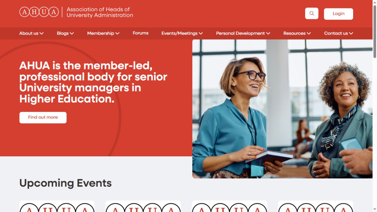
A confident red palette, clear typography and prominent imagery give AHUA a recognisable presence across its website.

Navigation around member needs

Membership, forums, events, personal development and resources have distinct places in the main navigation, alongside search and member login.

Events with a clear next step

Upcoming meetings and conferences are presented with their titles and dates, with routes from the homepage into the wider events section.

Resources and editorial content

Separate layouts for blogs and resources help visitors distinguish commentary, updates and practical information.

Responsive front-end layouts

The front end brings headings, imagery, navigation and content cards together in layouts designed for different screen sizes.

A consistent experience across sections

Shared visual elements connect the homepage and content sections, while allowing events, membership information and articles to serve different needs.

Design and development handled by the same team

VisionSharp carried out the full redesign and front-end development for AHUA. That meant taking the visual direction through to the templates and components visitors use on the website.

The design brings together a prominent introduction to AHUA, a structured navigation system and dedicated areas for current events, blogs and resources. Each has its own purpose, while sharing a consistent visual language.

This is an example of our WordPress website development and UX and UI design: shaping the presentation around the organisation, its content and its members.

VisionSharp ecommerce website development team planning an online store project

A website organised around the member journey

From discovering AHUA to returning for an event, article or resource.

01

Introduce the organisation

A prominent homepage introduction explains who AHUA serves, with a direct route to learn more about the association.

02

Find the right activity

The main navigation separates events, membership and professional development so visitors can choose the area relevant to them.

03

Explore current information

Event dates, recent articles and resources appear in distinct homepage sections, giving returning visitors several ways into current content.

04

Continue into the member experience

Visible login and forum links connect the public-facing website with the existing member areas. The redesign sits around those established services.

A coherent website for AHUA and its members

The completed redesign brings AHUA’s public information, events and resources into a consistent front-end experience. Its red brand identity carries through the navigation, homepage and content areas.

The result is a website that presents the organisation clearly and gives members visible routes into the services and information available to them.